File Details |
|
| File Size | 2.0 MB |
|---|---|
| License | Open Source |
| Operating System | Windows 7/Vista |
| Date Added | June 17, 2010 |
| Total Downloads | 2,113 |
| Publisher | gdipp Team |
| Homepage | gdipp |
Publisher's Description
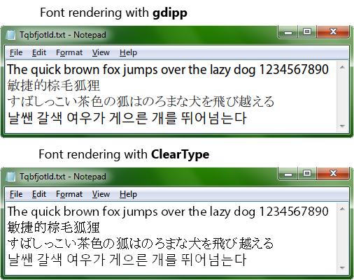
gdipp is a replacement of the Windows default font render, which brings to you the effect of text like Mac OS and Linux distributions. It is easy to use with ignorable overhead, and it is fully customizable.
Latest Reviews
coover reviewed v0.7.6 on May 14, 2010
I am so impressed that I have now installed this on all 3 of my Win 7 64 bit computers. This morning, without even knowing that it was done, my wife commented on how clear the text on her screen appeared.
jcollake reviewed v0.7.6 on May 14, 2010
Very interesting. The screenshot certainly looks better. I'm curious as to whether the ClearType can be tuned via the ClearType tuner to better compete with this renderer. I assume they didn't intentionally make ClearType look bad to demonstrate the difference ;).
The ironic thing is that ClearType is supposed to be superior to the anti-aliasing in linux and OS X. After all, there is a lot of intellectual property backing up ClearType. Ok, maybe I just bought into the company line ;p.
UPDATE: I now tried this alternate renderer. In my case, I find tuned ClearType to be superior. It is probably due to my LCD resolution though, and I'm sure an LCD with a lower resolution would look better. For instance, as opposed to the screenshot, my fonts are rendered more boldly with ClearType than with this renderer. I did not immediately see any way to tweak this renderer, and that's one thing that needs to be added. They need a tuner as with ClearType, and need to be sure to support individual tuning of different monitors.
nugro reviewed v0.7.6 on May 14, 2010
Works great here! this is clearly superior than cleartype, pun not intended! :p
For setting you have to edit the xml file, more here http://code.google.com/p/gdipp/wiki/SETTING
There's still some bug I found with Opera in certain site but I still think this looks more pleasant than cleartype in my eyes. Have to get used though.
Galifray reviewed v0.7.6 on May 13, 2010
A for effort, C for execution, hence the four stars.
Oh, I liked how it made things look, but there is a glitch in how it works. When I opened an application, such as notepad or wordpad, there is a perceptible flicker as the cleartype is overriden by the gdipp setting. Also there is no graphical application that I could find for fine tuning the settings.