File Details |
|
| File Size | 0.8 MB |
|---|---|
| License | Freeware |
| Operating System | Windows 7/8/10 |
| Date Added | April 25, 2015 |
| Total Downloads | 2,108 |
| Publisher | Julien Manici |
| Homepage | Immersive Explorer |
Publisher's Description
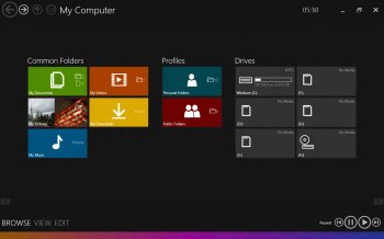
Immersive Explorer is designed to be an alternative to the default file explorer included in Windows (known as Windows Explorer). Although it is not a Windows 8 "Metro application", it is designed around the "Metro" user interface guidelines. It will be optimised for touch-screens, but will offer a great experience for desktop users too (with features like scroll-to-zoom, keyboard navigation). It uses graphical hardware acceleration to display fluid animations and transitions, making it look more modern than the default GDI-based Windows file explorer.
Latest Reviews
Nighted reviewed v1.2 on Apr 29, 2015
Why? WHY???
Soon the Windows OS will go to the cloud and people will be flocking to Linux.
Make more Linux apps not this ugly Metro UI designed for 3 year olds.
honyin reviewed v1.0.8 on Jul 24, 2014
Why bother testing a cripleware?
CyberDoc999 reviewed v1.0.8 on Jul 24, 2014
my guess is the author will start charging $$ when it gets popular
garretthylltun reviewed v1.0.2 on May 27, 2014
Regardless of the opinion of the Metro Interface, this program works very well. If you're trying to match up with the Metro Interface, then this is a good fit. I actually enjoyed using this program but grew tired of the update issue I note next.
My only complaint is that the author has built in update checking. If there is an update, it ask you if you want to update, if you say no, the program closes and you cannot use it until you upgrade. You are forced to upgrade. This is a big NO NO in my book.
montessa reviewed v1.0.1 on Apr 15, 2014
A great effort. Perhaps this is the sort of app that should be an option to all new windows apps i.e. be able to toggle between a touch enabled view to a traditional desktop view.
Really, doing as the author has done here would have been an alternative approach rather than a pure Modern app.
CyberDoc999 reviewed v0.3.0 on Oct 3, 2012
very ugly and of no real use
Hall9000 reviewed v0.3.0 on Oct 1, 2012
My honest opinion? Still looks as fugly as Metro. The only way you could make me like it is if I had full control of how those icons look. Color, shape and such.
